Hovering and Hogging
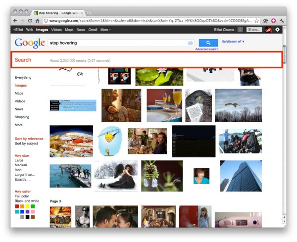
I know almost nothing about UI and ‘usability’. However, I know when something is stupid. And these hovering bars that follow you as you scroll (highlighted in red) are stupid. They are not just over-sized and ugly, but are actually giving me zero useful information and permanently taking up a sizeable chunk of the page. Do I really care that there’s ‘about 2,230,000 results’? Or am I ever likely to think ‘Crap, am I reading the politics section of the Guardian? Oh, I’m at the ‘In Pictures’ section, right. That hovering bar is handy’? No I’m not. So leave my limited pixel space for actual content.
And, this is Google and the Guardian doing this. Sort it out guys.


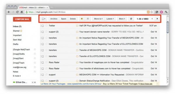
Gmail gets it right though, displaying actual useful tools that I’m likely to use when scrolling: 